You can remember it as if it happened yesterday, even though it was nine years ago. You and the other members of the marketing and management teams stood around a conference table staring down at printouts of the five finalists from which you would choose the logo and color palette for your newly-formed company.
Sara, the summer intern/budding graphic designer stood apprehensively outside the circle, waiting for the final verdict. The CEO spoke up first, “I like this one.” With very little dissent, his choice was confirmed, and there was much rejoicing. And a post-work trip to the nearby pub to celebrate Sara’s masterpiece that would undoubtedly last a lifetime.
Not so much.
Now, nearly a decade later, you look at that first DIY logo, and with no disrespect to Sara (who changed her major to sociology when she returned to school), you realize it was never all that awesome. And it has not aged well.
Yes, it’s time for a brand refresh. It happens, even with truly outstanding visual identities. Below are some additional signs that maybe it’s time to put that old branding out to pasture.
- Inconsistency — There are multiple versions of your logo in a rainbow of unauthorized colors used heaven only knows where. While companies wisely allow a little more latitude with how their logos are used these days, that doesn’t mean wholesale changes made by anyone with access to Photoshop are OK.
- Inaccuracy — Sometimes branding looks fine aesthetically, but because of changes to your company (new products, new markets, mergers, a new focus, etc.), it no longer makes sense. Ideally you’ll be ahead of the curve on this and will implement new branding at the same time you announce the changes. If not, it’s time to start playing catch-up.
- Disconnect — You had your branding created by a professional designer, ran it by absolutely everyone in the company and it won unanimous approval. So you implemented it, thinking some day your logo would be in the Logo Hall of Fame alongside Coca Cola, BMW, and Starbucks. The problem is, your target audience doesn’t like it, or doesn’t get it. And really, their opinion is the only one that counts. If your branding doesn’t resonate with them, it’s time for a change.
- Busy or Barren — You wanted to be sure your logo thoroughly spelled out everything you do, and you ended up with visual chaos. Or, you thought it would be hip to go minimalist and have a logo that’s just a blue triangle. Nothing else. People would get it, right? Right?! Nope. The current trend is toward the middle way: a logo that makes it clear what you do but in the simplest possible way.
- Baggage — The legal trouble your company went through a few years back is gone, but still there’s a gray cloud hanging over your brand. Refreshing your visual identity can help make the statement that things are different now.
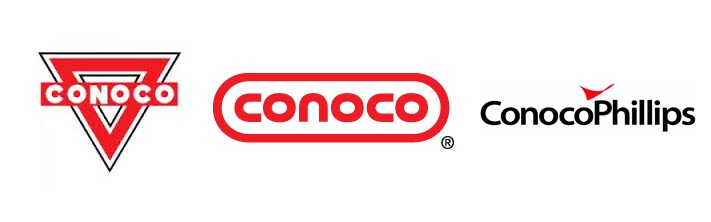
- Well Worn — Sometimes a brand, even one that was once effective, simply needs an update. Conoco's branding iron brand was known around the country, but it looked more like the YMCA logo with each passing year, and certainly it didn't send the message that the company was innovative... and the capsule was born.
So, while your branding is something you don’t want to change often, and only with careful consideration, there are times when it’s the right thing to do. We’ve helped companies in a wide range of industries create or refresh their visual identities. We’d love to share what we’ve learned with you.