Infographics are a proven tool for communicating data quickly, clearly, and in a way that engages the viewer. And they can be a key component of a content marketing program. That said, all infographics are not created equal. As you would expect, some are better at grabbing and keeping the attention of a target market. But, what’s the right “recipe” for an infographic? You can certainly start to zero in on what works through trial and error. However, a better approach is to use data to drive your decision making.
That’s what Growista did. They programmatically analyzed 1,000 infographics to see which ones earned the most social shares. Now, of course, different studies will come up with different numbers. But, if you have not conducted your own analysis of thousands of infographics (ideally your own), the numbers below are, at a minimum, great food for thought.
Characteristics of Engaging 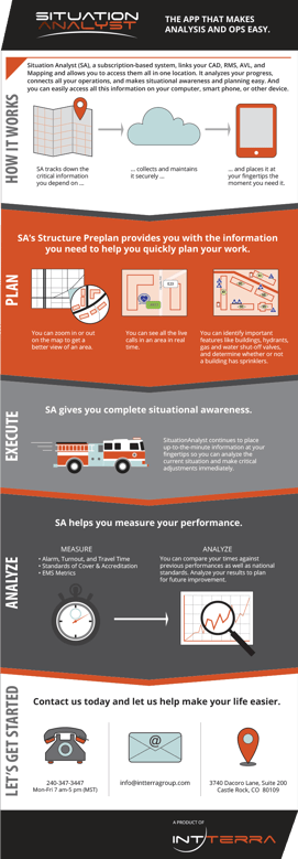 Infographics
As you create infographics to power your inbound marketing strategy, here are some stats and observations to keep in mind:
- Keep them visual. The “article” that leads into and wraps up an infographic should be no more than 200 words.
- Watch the width. The ideal width for an infographic is approximately 650 pixels. However, interestingly the height of the piece doesn’t seem to impact its effectiveness.
- Keep titles tight. A length of roughly 65 characters is best for infographic titles.
- Don’t worry about the body words. The number of words within the body of an infographic doesn’t seem to impact the number of shares.
- Minimize charts. While they are “visual,” too many charts in an infographic can hurt its effectiveness. Limit them to one or two.
- Use the right social platforms. Twitter and LinkedIn tend to produce the most shares, followed by Facebook and Pinterest.
- Authority matters. The data shows that there is a clear relationship between the “domain authority” (i.e. a score for how well a site does with the search engines) of the site where an infographic resides and the number of shares. Whether your piece will reside on your site or elsewhere, this is something to consider.
The Big Picture: Data-Driven Decisions are Critical
“Those figures are interesting,” you say, “But we don’t use infographics.” Fair enough, but don’t miss the broader message here. By that I mean that inbound marketers (especially experienced inbound marketers) should avoid the temptation to “trust their instincts” and should measure and analyze actual results of their efforts instead.
Marketing is both an art and a science. In decades past, it was common that the “art” took center stage. In today’s digital world, however, our ability to accurately measure engagement has grown by leaps and bounds. For example, marketing automation tools like HubSpot (full disclosure: we are huge HubSpot fans and are HubSpot Agency Partner Certified) can give you insight into the effectiveness of your marketing content in ways people hadn’t dreamed of not long ago. As a result, successful marketers are starting to shift their focus from purely creative to analytics-driven.
Comprehensive Content Marketing Assistance
At 30dps we’ve got two powerful passions that complement one another beautifully: a love of compelling content and a drive to deliver and promote it in the most effective ways. Our content marketing agency has teams in Colorado Springs, CO, Olympia, WA, and Springfield, MO, that eat, sleep, and breathe inbound marketing. A bit obsessed? Maybe. But nothing makes us happier than seeing our clients in a wide range of industries—from B2B and B2C to manufacturing—achieve outstanding results and capture more market share from their content marketing efforts. Learn what we can do for you by contacting us today.