Custom modules are one of HubSpot most powerful CMS features. It's a self-contained element in HubSpot, and can be used on a page just like the built-in HubSpot modules. But, it’s custom built to display exactly that data you want (or make it flexible and display a wider range of data you think it should.) The good news is, that the Custom Module is flexible enough to do both. And it has self-contained style sheet and javascript support elements to ensure that any custom code and style will transport easily to different pages, themes, or web sites.
This walkthrough will cover creating a custom module through the HubSpot design manager, and not the CLI option.
Create a New Module
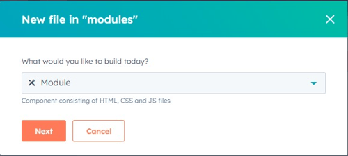
Creating a new module is in the same New File command in the Design Manager screen. In the New File dialog, select the Module from the new file popup. When creating a new module, you must select the areas of HubSpot you intend to use in the module. 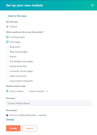 This filters the modules so you only see the Modules designed for the area being modified. And if you are building a module for use in Emails, some elements (like the CSS and JavaScript features) will be unavailable. Also, you will be choosing if the module is intended to be used locally only or as a global module. A global module will be locked and any instances of the module will use the default data you specify when building it. Keep in mind you can still use a local module in a global content area and be able to select the content for the global instance of the content element.
Basic Module Features
Your module consists of two major sections. The left panel has the HTML, CSS and JavaScript for your module. This is responsible for the HTML and support resources that will be displayed for the user. The module.html panel is where you will put the HTML code responsible for displaying your module on the page (or email, etc.) This panel will consist of both your static HTML and will also allow you to use any HubL variables (module specific elements, covered below, global HubL variables and, if building the module as a part of a theme, any theme variables.) The right panel has the admin elements you will use to configure your module. Here, you will name the module, add fields the page editor will have access to, and other behind the scenes settings.
Module admin elements
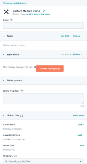 The area to the right of the window has the administrative elements of your module.
Module Name
The top section is where you name the module The file name is the actual name of the module in the HubSpot file area. If you change the name, you may need to update instances of the module used in your templates. The label is what a page editor will see when selecting the modules for the page. This may be changed anytime and not damage any module paths in templates. Clicking the icon will also allow you to change the icon the page editors will see. You may browse from hundreds of icons HubSpot has included, or upload your own SVG file. This can be useful to more easily find your module at a glance when it's in a list of all of the other modules.
Module Fields
The fields section is probably the most used area of your module. Fields are data elements you are giving the page editor to change when they add your module to a page. HubSpot now has dozens of different field elements available for you, each with their own unique features and elements. I’ll cover a few of the most common/useful ones.
 A few elements that are common to all fields.
- Name: the label the page editor sees when entering content into your module. This should be as descriptive as possible, but it is just a label.
- HubL variable name: the HubL variable you will use to refer to this object in your module.html area. This will not be seen by the page editor, and must be unique to your module. It will be defaulted based on your field’s name, but can be changed. Keep in mind if this changes, any references to the name in your module will also need to be updated.
Content Options will have the content fields unique to the field type available for data. Most of these are related to the default values you want populated in the module when a new instance is created. However, there are some additional fields that aren’t directly displayed but allow you to manage the options the page editor has when using the module. This will range from the default values you may want to pre-populate in your module, to image controls, to restrictions placed on the page editor when entering data into your field.
Editor Options will allow you to put some limits on and give page editors some additional information when they are dealing with a specific module field.
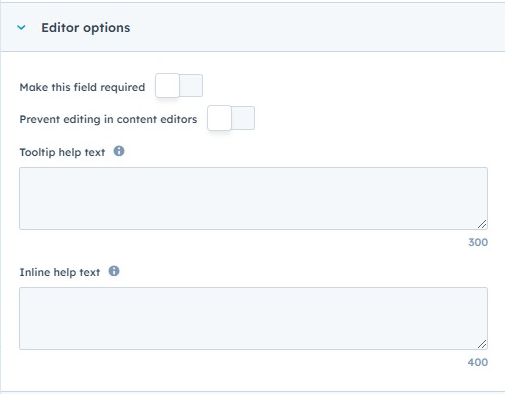 Make this field required will require a page editor to have a value for this field.
- Prevent editing in content editors will lock this field for the page editors; your default value will be used.
- Tooltip help text will be a popup next to the field’s label for the page editor.
- Inline help text will appear below the field’s label for the page editor.
Display Conditions will allow you to hide this field from page editors based on other field values in the module. For instance, if you want a text field and its label to be hidden from the page editor if they haven't entered a value in another field, the conditions will allow you to manage that restriction.
Repeater Conditions allow you to specify that the field should have multiple instances in the module. We will cover this in a separate blog post in the future.
Common Field Types
- Rich Text: The standard HubSpot rich text editor. Gives the page editor the full WYSIWYG toolset including fonts/styles/colors, links, images, etc.
- Text: A single line of text. Useful if you want to give a user a header field or hyperlink text and not allow them access to style it in the rich text editor.
- Link: A variable that will contain a link to something. You are able to restrict the page editor to specific types of links (internal pages, external links, files, etc.)
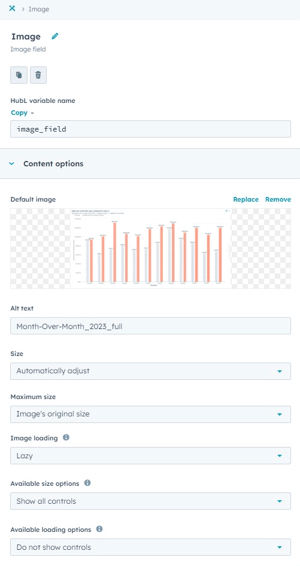
- Image: An image in the HubSpot file library.
- Icon: A FontAwesome icon; sometimes it can be easier for a page editor to pick an icon rather than an image.
- CTA: Select a HubSpot call to action.
- Form: Select a HubSpot form. Also allows the page editor to override the thank you message or page.
- Blog: Select a blog in your HubSpot instance.
- HubDB table and HubDB row: Select a HubDB table or a specific row in a HubDB table.
- Boolean/Choice: Give a page editor a boolean checkbox or a limited set of options. The can be directly output to the screen, but are usually used to manage other fields in your module.
Each field has an actions menu for quick access to some key field elements. The two most critical elements are the copy features.
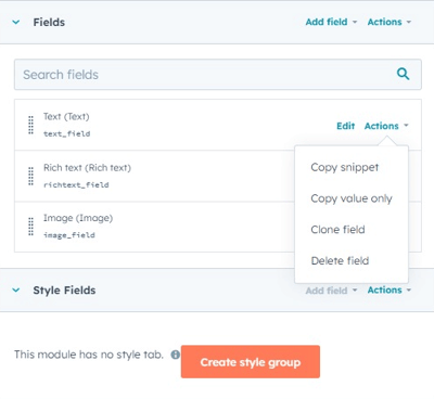 The Copy Snippet will put the HubSpot default HubL code to display this field on your clipboard. You may then paste this code into the module.html area to display the field. This is the best way to display some elements, such as the Rich Text, Fields and Image field types, as it will create default code for some of the field’s critical elements if the object is a complex HubL dictionary (has sub-elements under the parent variable.) Sometimes, the HubL code will have multiple lines with it to ensure all of the field elements are covered (such as image sizing or adding support code for the link element if an email option is specified. But, this default HubL code can be modified at your discretion.
The Copy Value Only will only grab the variable name for the clipboard. With most elements, it’s not enough to display this (if the field consists of a HubL dictionary with multiple sub-elements.) But, you can output the field variable to see all of it’s dictionary elements (especially when using the pprint “pretty print” filter on the variable. Or, you can use the variable name in any HubL logic code you have. {% if module.<fieldname> %} is a good way to make sure the variable actually has a value before trying to output it in the display code.
The Clone and Delete options are straight forward. Clone will make a copy of your field (and all of it’s defaults and configurations) and Delete will remove the field from your module.
The Style Fields section is similar to the Fields section, but the fields are specifically designed for use in a style block. We will cover this in another blog post.
Linked Files allow you to link external files to your module. This is especially useful if your module is not part of a theme and can be copied to other HubSpot instances (these files will be considered linked to your module and copied, too.) Also, you may specify external CSS and JavaScript files that will be included on a page with your module. If you intend to have a common stylesheet for multiple modules you are building, you should link it here. Also, if your module has any fonts or images that are used in your html area or css, you should link them here to ensure they are available to your module.
Building the Display HTML
 The module.html section is where you will be placing the HTML code responsible for displaying the field variables you have created in your module. It is not limited to these variables; it will probably be necessary to have some custom HTML in addition to your field variables to ensure the data is displayed correctly. For instance, if you have two Rich Text fields that should be displayed side by side, you will need to surround the Rich Text field variables with divs with the appropriate classes. These classes may be in your page/theme’s included stylesheet, or in a style sheet linked to your module, or a style specified in your module.css section below.
Keep in mind that if a field isn’t required or is governed by a display condition, you should have logic to keep the field from being displayed if there is no value in the field. i.e., if an image isn’t required, and the page editor hasn’t selected one, you should not try to display the image in the module.
This section is the only area of your module capable of displaying HubL variables. So, if you have variables specified in the module’s Style Fields or any Theme Variables you want to use in the module, they will need to be either inline styles in your HTML tags (not recommended) or in an embedded style sheet. If you’re using an embedded style sheet, it is recommended you wrap the <style> tag with the HubL tag {% require_css %}{% end_require_css %}. This will place the <style> tag in your page’s head tag. Likewise, if you have HubL variables you want to use in a JavaScript block, you will need to have the javascript function in an embedded javascript. Similar to the style sheet, you should wrap your <script> tag in a {% require_js %}{% end_require_js %} tag. It has a parameter that allows you to specify if the <script> tag should be in the header or footer area of your page.
Adding any static CSS
The module.css will be a CSS file for your module. Only static styles can go here; HubL variables are not supported. This area will be generated as a separate css file and will be automatically included on any page using this module. And if you have multiple instances of the module on the page, it will only be included once. Styles specified here will override any styles you have in other style sheets on the page. For example, you may override the styles for heading tags and change their color in your module without changing the color for other heading tags that could be on the page that aren’t in your module.
Adding any static JavaScript
The module.js will be a javascript file for your module. It works just like the CSS file; HubL variables are not supported and it will be included on any pages using the module. Assuming you are using JQuery and it’s already embedded on your page, this is the perfect place to add a $( document ).ready() function to trigger any functions specific to your module. And if you specified any global variables in your module.html script tags, they should be available for use.
Just like a page, your module can be previewed. You will be able to experiment with different values for your fields to make sure everything looks correct across the various screen sizes. Keep in mind that the preview will only have access to the styles and javascript specified in your module. So if you are expecting the module to inherit the stylesheet from your theme or page template, it will. But the preview won’t have those styles available.
Publishing your module will immediately update any instances of the module in use in the HubSpot instance. Keep in mind that default values could be changed. And if you added any new fields to a module that’s already in use, make sure you visit each instance to verify everything looks good. If you click on the module’s name in the far left assets panel and select “Show Dependents” you can see a list of all of the areas where the module is used.